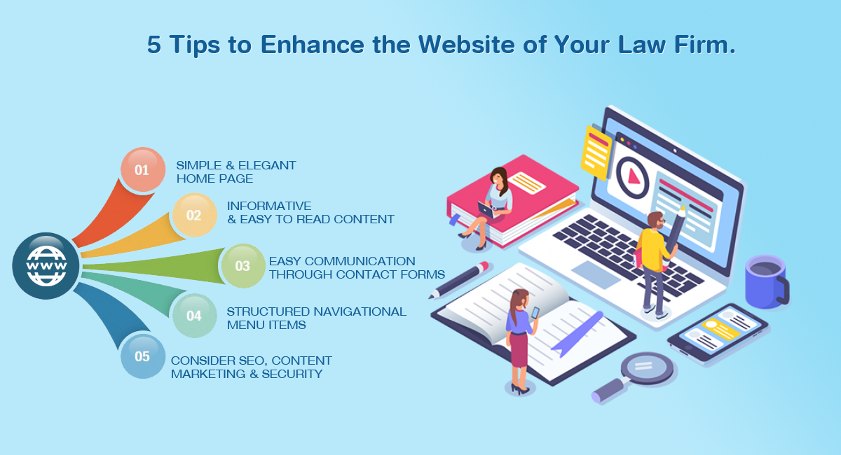
In the last two decades technology has created a big impact and differences in all aspects. Businesses are adopting and leveraging technology for growth and cost reduction. Law firms also are not untouched by this wave. A professional website is a first and foremost step towards technology adoption.

There was a time having a website was considered a luxury but now
“Having a Un Professional Website is Even More Dangerous Than not having it.”
Let’s see how you should plan the website so that not only it creates a great social impact but also acts as a catalyst for the growth of your law firm.
- Keep the Home Page Simple & Light.
- The home page of your website should be light. It should have less but impactful content. Do not overload with so much information and make it cluttered.
- Keep the background light and use suitable images.
- It should work in all the browsers.
- It should be responsive i.e. could be seen easily on any device such as laptop, desktop, tabs, and mobile phones.
- Informative and Easy to Read Content
- Make sure you use a suitable font, adequate font size, and colour so that it’s easy to read considering various age groups.
- Ensure you have got nice and crisp content expressing your expertise.
- Do not use too much technical and ornamental language. It should be easy to read considering all the segment of viewers.
- Double-check your spelling, sentences, and grammar.
- Easy For your Clients to Contact You
- Ensure your email and phone is visible to the users without any clicks. Having these in the footer is the most ideal. Your visitors can view it just by scrolling.
- Make sure you have got a working email and phone number mentioned in the contact section. It should be a hyperlink so that just clicking it opens Outlook to compose the new email.
- Having a Contact-Us form is the more professional way nowadays. It should be a simple form where your clients or prospects can write their enquiries. Do not ask to enter so much information, just the Name, Email, Cell, and Description should be sufficient.
- You may consider having a captcha to ensure its human intervention not automation. In a survey, it’s seen nobody reads the email which’s mentioned on the website. Also, the data posted through Contact Us form is sent to the one who’s not concern or not bothered, eventually, any action is not taken on any enquiry. This leaves an extremely poor impression on the visitor who’s seeking some information.
- Proper Navigation
- Segregate the content into relevant pages but ensure it’s easy to navigate.
- The top navigation menu should be sticky. With this, it’s easy for your visitors to navigate through the information present.
- Do not have so many items in the top navigation menu.
- Top Menu: You may have the following items on the top menu
- Home / About Us: It could have a slider
- Expertise: Mention the practice areas you deal with and some case studies outlining your experiences.
- Key Persons: Mention key people, their experiences, and qualification. Also, give a link to social handles such as LinkedIn and Twitter.
- Blog: Link to your blog posts.
- Contact Us: Firm address along with the google map should come here. Also, have a contact us form should be given to post any enquiry.
- Footer: Some information should be placed into the footers which are always sticky. These links are Home, Key People, Practice Areas, Blog, Careers, Client Testimonials, and Contact Us, etc.
- Consider SEO, Content Marketing & Security
Before we speak about SEO let’s know first ‘What is SEO?’
SEO, known as Search Engine Optimization. It’s the process of improving the quality and quantity of website traffic to a website or a web page from search engines. To have the better SEO you need to take care of the following things in your website:
- Write unique and relevant content.
- Use relevant keywords in your content.
- Add internal links to your new pages
- Do not have the broken links
- Have Google Analytics to monitor the traffic. This ensures if your SEO is working or not.
- Link your social media posts with your website content.
Last but not the least, ensure the content you’re writing it’s for humans first, search engines second. Many times, in the lust of creating SEO-friendly content people tend to lose the simplicity.

Has 18+ years of experience in UI/UX Architecture of Enterprise Applications along with a specialization in Social Media, Digital Marketing and SEO
 English
 French
 German