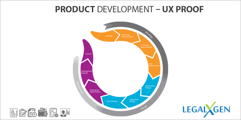
The objective of this post is to share my product development experience, especially from the Usability perspective. I am assuming that there is no doubt about Usability as an essential factor in Product Development, you can’t afford to ignore it. It becomes even more critical in a B2C scenario when your target users are moving towards accepting Software for the first time.

Conceptualizing a product idea is the easiest part of the Product Development Process. In fact, any person who has been in the industry for some time can be a self-proclaimed expert idea generator.
But the real challenge begins when one starts conceptualizing the idea and translating them into technical design. From the onset of various technology frameworks and design patterns flooding the development space, for sure you are spoiled for choice. Choosing the right Technology Stack & the framework is again based on product goals, team’s skills, experience and comfort levels. Anyway, that is a different space altogether and I don’t have any intentions of digressing.
The important point here is to include Usability as one of the primary goals when evaluating various technology stacks. The questions you can ask during the evaluation process are :
1. What kind of UI/UX capabilities does the framework offer?
2. Does it align with your primary design goals ( e.g. Responsiveness for Mobility enablement)
3. Cost Involved if any.
4. Learning Curve.
Applications developed using the framework can be a good reference point to understand its capabilities.
The next stage is Design, Wireframes & Prototyping. This is where the product-specific UX/UI guidelines should be defined. Prototyping or Wireframes are not just for translating user stories, they should also address UX objectives.
One approach is to identify & create user segments. Say, there are two major segments identified Tech-Savvy and not so Tech-savvy. The design should aim to address the lowest denominator which is the latter. There will be cases when these segments are not so straight forward, but the idea here is to have the identified user perspective when creating Wireframes.
One simple example is to have an explicit “Back” button for navigation in all transaction screens.
Following links can be used to validate the UX goals
http://suprq.com/
http://www.measuringusability.com/blog/fundamental-usability.php
Implementation is the most challenging aspects when it comes to Usability. Primary reason being the development approach and culture, where most of the focus and energy is spent on completing functionalities in the stipulated time frames. UX Objectives get diluted even more at the developer end, in cases where you have dedicated Usability Team. It is quite similar to get developers to do Unit Testing, but we all know how tough it is to make it work.
There are no simple solutions to it. Understanding the importance of Usability and educating the implementation team is a must. It is equally important to lay down the objectives and include them as part of deliverable.

Has 18+ years of experience in UI/UX Architecture of Enterprise Applications along with a specialization in Social Media, Digital Marketing and SEO
 English
 French
 German